

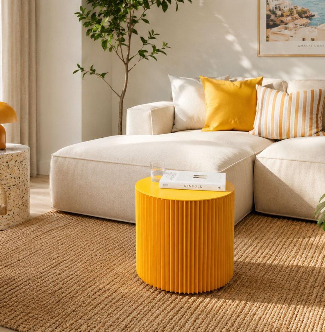
A tester pot shows you a colour on a wall. It doesn't show you how that colour lives in your room, next to your sofa, across a week of walking past it. A small piece of furniture does, and it lets you inject colour into a room without committing to paint at all.
The colour wheel is a starting point for seeing which colours naturally work together. The best choices come from understanding proportion, the effect of light, and an easy way to test colour before committing to paint.
What the colour wheel is actually telling you
Complementary colours sit opposite each other on the wheel: blue and orange, red and green, yellow and purple. Put them side by side and each one looks more intense than it does alone, which is why they bring so much energy to a room and respond beautifully to thoughtful balance. Proportion is what saves you. One colour dominates and the other turns up in small doses. Weight one colour more heavily and the pairing feels confident and intentional.
Analogous colours are neighbours on the wheel: yellow, orange and red, or blue, teal and green. Low contrast, nothing competing, and the result reads as considered rather than loud. This is the safest scheme going, and the one most people arrive at by instinct without knowing it has a name.
Triadic colours sit evenly spaced on the wheel, three points of a triangle: red, yellow and blue is the obvious set. It takes a little more confidence and can be wonderfully playful, which is why you see it in playrooms and studios far more often than bedrooms.
One more worth naming. A monochromatic scheme uses one hue in different tints and shades, and texture is what brings it to life. Layer it well and the result can feel rich, polished and inviting.

|
Scheme |
How it works |
Feels like |
Best used in |
|---|---|---|---|
|
Complementary |
Two colours from opposite sides of the wheel, heavily weighted to one |
Energetic, confident, high contrast |
Living rooms, retail displays, anywhere you want a focal point |
|
Analogous |
Two or three neighbouring colours |
Calm, cohesive, easy to live with |
Bedrooms, hallways, open plan spaces |
|
Triadic |
Three colours evenly spaced around the wheel |
Playful and busy, needs discipline |
Kids’ rooms, studios, creative offices |
|
Monochromatic |
One hue, varied in tint, shade and texture |
Quiet and considered, or flat if texture is missing |
Small rooms, snugs, minimal schemes |
The wheel tells you which colours work together. What it does not tell you is how much of each to use, and that is where a colour scheme really comes together.
The 60 30 10 rule, and where furniture actually sits
Decorators have used this for decades because it holds up. Sixty per cent of a room is the dominant colour, usually walls and large areas of floor. Thirty per cent is secondary, so the sofa, the curtains, a big rug. Ten per cent is the accent.
That last ten per cent is where every bold decision can shine, with more scope than many people realise. Cushions and prints usually get there. Furniture rarely does, because most furniture is too big and too expensive to be a ten per cent decision. A red three seater, for example, is a sizeable way to test how red feels.
A stool is a different proposition. So is a footstool. Both are small enough to read as an accent rather than a commitment, which makes them the obvious place to put your strongest colour. A single foldable stool in yellow will do more for a grey room than another cushion ever will, and a pair of footstools in the same colour will tie two ends of a room together for less than the cost of the cushion covers.
Scale up carefully. A bench in a strong colour is closer to thirty per cent than ten, so it wants a quieter room around it. Display pillars are the exception. In a shop the accent has a different job to do, so the colour belongs underneath the product rather than on it, pulling the eye towards the thing you are actually trying to sell.
Your windows are changing the colour
North facing rooms take cool, blue-leaning light for most of the day, while south facing rooms get warm light throughout. The same tin of paint can produce two visibly different colours, so real-room testing matters more than theory alone. You have to look at the colour in the actual room.
The standard advice is to warm up north facing rooms and cool down south facing ones, but that is only half right. The better question is when you use the room. A north facing home office used from nine until five genuinely does want warmth, because you are sitting in that cool light all day. A north facing bedroom you only see after dark is lit entirely by your own lamps, so the daylight cast never arrives and any colour can work.
Check the colour at three points: morning, mid afternoon, and under artificial light in the evening. A colour that works across them all is likely to be a confident choice.
Colour feelings are real, and colour psychology is a useful guide
Yellow can feel warm. Blue can feel calm. Red can feel energetic. These associations are real, most people share them, and they are worth listening to when you are picking a scheme.
What they aren't is a design rulebook. You cannot pick a wall colour purely from the feeling it evokes. The practical rules matter just as much. Saturated colours pull the eye and hold it, which is why they work beautifully as accents and can feel intense across whole walls. Dark colours can make a room feel more intimate, which may be perfect in a snug but less suited to a narrow galley kitchen. Contrast creates hierarchy, so whatever is the brightest thing in the room is the first thing anyone looks at. Decide what that should be before you decide what colour it is.

The commitment ladder
Not every colour decision costs the same to change your mind on. Ranking them by cost and effort makes the order of operations obvious.
|
Change |
Rough outlay |
How long to undo |
Risk if you get it wrong |
|---|---|---|---|
|
Repainting a wall |
£40 to £100+ in materials |
A weekend, twice if it needs two coats |
High. Sunk time as much as money |
|
New sofa |
Hundreds to thousands |
Months, and a collection to arrange |
Very high. You live with the mistake |
|
Large rug |
£100 to £400+ |
Immediate, if another room will take it |
Medium |
|
Accent furniture |
From £30.99+ |
Seconds. It folds flat and goes in a cupboard |
Low |
That bottom row is the whole argument. A Concertina Paper Stool starts at £30.99 and folds flat when you are not using it, which makes it the ideal way to bring a bold colour into a room without the walls having to carry it. A yellow stool against grey walls. An orange bench in an otherwise neutral room. A red footstool at the end of a hallway that stays quiet everywhere else. The accent is where the colour lives, and the rest of the room does the quieter work around it.
That is the ten per cent from earlier, in action. Start there.
Which colour does what
Stools come in white, black, brown, recycled kraft, yellow, orange, red, blue, green and pink. Benches run the same range with the exception of pink. The recycled collection behaves as a neutral rather than a colour, which makes it the base layer for everything else.
|
Colour |
What it does in a room |
Pairs with |
Where it earns its keep |
|---|---|---|---|
|
Yellow |
Becomes the brightest thing in the room and reads warm even in cool light |
Grey, navy, natural wood |
North facing rooms, kitchens, children’s spaces |
|
Orange |
Warm and lively without yellow’s glare |
Blues and teals, or kraft brown for an analogous run |
Living rooms, studios, retail displays |
|
Red |
The highest impact colour in the range, so it needs the smallest dose |
Greens, black, off white |
Dining rooms and statement corners |
|
Blue |
Visually recedes, which settles a busy room |
Orange and rust, or greens and teals |
Bedrooms and home offices |
|
Green |
The easiest bold colour to live with, and it sits happily beside plants |
Pinks, terracotta, warm neutrals |
Living rooms and anywhere with greenery |
|
Pink |
Warmer and far more forgiving than most people expect |
Greens, greys, brass |
Bedrooms and dressing areas |
|
Black |
Anchors a scheme and sharpens everything around it |
Anything at all |
The grounding note in any palette |
|
White |
Steps back politely and keeps a small room feeling open |
Everything |
Small rooms, galleries, minimal schemes |
|
Brown and kraft |
Reads as texture rather than colour, so it behaves like a neutral |
Every accent colour in the range |
The base layer of a warm neutral scheme |
Three schemes you can build this weekend
Warm neutral with one vivid accent note. Kraft and brown as the base, then a single red or orange piece carrying the entire ten per cent. This is the most forgiving of the three because the base creates a calm, neutral foundation, and it suits any room with wooden floors. Group kraft stools around a low table and add one orange bench. Then let that focused accent do the work.
Blue and orange, properly weighted. The classic complementary pair, and one that shines when the amounts are deliberately uneven. Let blue take the room through walls or a large rug, then bring orange in at stool scale only. Two orange stools in a blue room look intentional. Keeping the orange concentrated at stool scale gives the whole scheme clarity.
Analogous green for a room you actually relax in. Greens and teals through the larger pieces, with green stools and a kraft table pulling the warm end. Add plants and the scheme finishes itself. If you want more of this thinking applied across a whole room, the living collection is built around exactly this kind of layering.
Start with the accent
Every colour decision starts with the accent piece. It is the smallest step on the ladder, the fastest to reverse, and it will teach you more about how a colour lives in your room than any tester patch ever will.
The wall can wait.

Questions we get asked a lot
What is the 60/30/10 rule in interior design?
Sixty per cent of a room is the dominant colour (usually walls and floors), thirty per cent is secondary (sofa, curtains, a large rug), and ten per cent is the accent. Get the ratio right and almost any colour combination works.
How do you add colour to a room without painting?
Start with a small accent piece of furniture. A foldable stool or footstool folds flat when you are not using it. Then repeat the accent colour in a couple of matching cushions on other seating so it ties the room together as a considered scheme rather than a single splash.
How do I know if a colour will work in my room before I paint?
Check the colour in the actual room at three points of the day: morning, mid afternoon, and under artificial light in the evening. A colour that works across them all is likely to be a confident choice.
Which colours work best in a north facing room?
North facing rooms take cool, blue-leaning light for most of the day, so warmer colours like yellow, orange, red or pink balance the coolness. If you only use the room after dark, you have more freedom to follow the artificial lighting.
Should the walls be the same colour as my accent piece?
Not necessarily. The 60/30/10 rule works because the walls do the quieter background job (60%) and the accent piece brings the bold colour (10%). Painting the walls to match the accent removes the contrast that makes the accent work.
What are complementary colours?
Colours from opposite sides of the wheel: blue and orange, red and green, yellow and purple. Placed side by side they intensify each other, which is why they work as accent-and-base pairs. Weight one colour more heavily and the pairing feels confident and intentional.
Share:
Summer Hosting and the Housewarming Gift That Actually Gets Used
Recycled, Reclaimed and Recyclable Furniture: What Each Term Really Means